
L’Ile Douce: christmas packaging
The limited edition panettone collection presented by L’Ile Douce is a perfect example of how design marketing can play a crucial role in elevating a product and differentiating it in the market. Each panettone is not only a masterpiece of pastry craftsmanship but also a visual work of art, thanks to its innovative and thoughtfully designed packaging. This approach highlights how packaging design can be crucial in communicating a product’s value and quality, making it not only appealing but also memorable. The choice of colours, materials, and label designs has been meticulously curated to reflect the history and unique characteristics of each panettone, making every package a unique and distinctive piece.
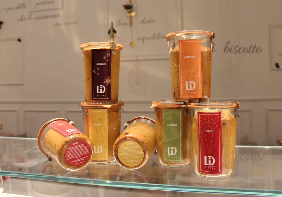
Panettone ISOLA: Tradition and Warmth
ISOLA panettone represents the classic of L’Ile Douce’s collection. This panettone features a red label, a colour that immediately evokes the warm and welcoming atmosphere of Christmas. Red has always been associated with the holiday season, evoking feelings of warmth, joy, and celebration.
In the context of design marketing, the colour red not only conveys a sense of urgency and importance but also stimulates desire and emotion, which are key elements for a classic product like panettone. ISOLA’s label is enhanced with golden details that further accentuate the festive and luxurious aspect of the product. The combination of red and gold not only celebrates Christmas but also emphasizes the quality and craftsmanship of the panettone, making each package elegant and attractive.
Panettone ROMANCE: Elegance and Refinement
ROMANCE panettone stands out with its packaging in an elegant Barolo Chinato colour, a deep and rich hue inspired by fine wine. This colour, ranging from dark red to intense brown, was chosen to evoke the elegance and sophistication of this panettone. The choice of such a sophisticated colour is intentional; it reflects the high quality of the ingredients and the distinctive character of the product.
ROMANCE’s label design celebrates Italian gastronomic culture through decorative elements that evoke tradition and refinement. Silver details and elegant patterns complete the sophisticated look, giving the panettone an aura of exclusivity. The packaging not only protects the product but also serves as a vehicle for a message of luxury and prestige, positioning ROMANCE as a high-end choice for those seeking a unique culinary experience.
Panettone L’ILE DOUCE: Freshness and Naturalness
For L’ILE DOUCE panettone, which contains pistachio cream, a vibrant green was chosen—a colour that immediately evokes the freshness and naturalness of the ingredients used. Green is often associated with health and nature, making it the ideal choice for a product that highlights pistachio as the main ingredient. This colour not only attracts the eye but also communicates the high quality and purity of the panettone.
L’ILE DOUCE’s label design features graphic elements that echo the shape and colour of pistachios, emphasizing the connection between the packaging and the content. Golden details and matte finishes create an elegant contrast that highlights the richness of the pistachio cream. This approach not only enhances the visual appeal but also helps communicate the craftsmanship and care put into making the panettone.
Panettone MORGANA: Sweetness and Cheerfulness
MORGANA panettone, enriched with candied apricots, is represented by an orange label that symbolizes sweetness and energy. Orange is a vibrant and cheerful colour that recalls the joy and cheerfulness of the holidays. This colour choice was made to reflect the rich and enveloping flavour of the candied apricots, creating packaging that is as inviting as it is delightful.
MORGANA’s label design includes graphic elements that reference apricots and their warm colour, creating a visual harmony that amplifies the perception of the panettone’s sweetness. Golden details and glossy finishes add a touch of elegance and refinement, making each package not just a container but a coveted item. Orange, with its ability to capture attention and convey a positive energy, makes MORGANA an ideal choice for those seeking a festive product that brings a smile.
Panettone GINGER: Warmth and Vibrancy
Finally, GINGER panettone, with its candied ginger, is represented by a yellow label—a colour strongly associated with warmth and vibrancy. Yellow, with its sunny and bright tones, reflects the spicy and sweet flavour of ginger, making the panettone not only appetizing but also visually stimulating. This bright and inviting colour not only captures attention but also expresses the uniqueness and originality of the panettone.
GINGER’s label design features details that evoke the appearance of ginger, with patterns that reference its natural shapes and tones. Glossy finishes and golden accents highlight the quality and elegance of the product, creating packaging that is both refined and attractive. This approach not only emphasizes the panettone’s uniqueness but also communicates the warmth and vibrancy that characterize its flavour.