NEW OPENING: ILE DOUCE MILANO
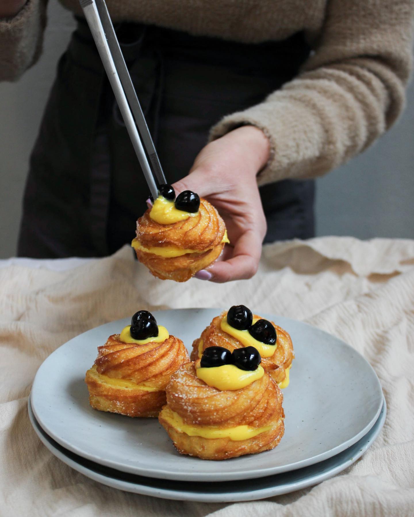
On October 15, 2023, a pivotal date for dessert and refined gastronomy lovers, L’Ile Douce was inaugurated, a French-inspired patisserie that has immediately captured attention for its elegance and exceptional quality of products. This new establishment represents not only a landmark for dessert lovers but also a brilliant example of how food marketing and food communication can be strategically used to successfully launch and promote a new brand. L’Ile Douce is not just a patisserie: it is a true haven for those with a sweet tooth and those seeking excellence not only in pastries but also in the tea culture. From the very first glance, the design and atmosphere of L’Ile Douce speak of meticulous attention to detail and a commitment to quality reflected in every aspect of the venue. L’Ile Douce’s founders have created a space that skillfully combines the art of French pastry with a welcoming and sophisticated environment, reflecting their passion for haute gastronomy and attention to detail. The choice to specialize in French desserts and fine teas is intentional. French pastry has always been a symbol of elegance and quality, with a tradition distinguished by meticulous preparation and refined flavours. L’Ile Douce has embraced this tradition, offering a selection of desserts ranging from classic French pastries like croissants and macarons to more innovative creations that reinterpret traditional recipes with a modern touch. Each dessert is prepared with the highest quality ingredients, often sourced from selected suppliers, to ensure an unparalleled tasting experience. Alongside the desserts, L’Ile Douce places special emphasis on its selection of fine teas. Tea, often considered the ideal companion to sweets, is chosen with the same care and attention as baked goods. The patisserie offers a wide range of teas, from the most classic to the most exclusive blends, allowing customers to pair the perfect tea with each dessert. The goal is to create a complete gastronomic experience, where tea and desserts are not just complementary but enhance each other, elevating flavours and offering a unique sensory pleasure. The launch of L’Ile Douce represents not only the opening of a high-level patisserie but also an example of how to design marketing, food communication, and social media marketing strategies can be employed to create and promote a successful brand. In an increasingly competitive market, the ability to differentiate and effectively communicate one value is crucial, and L’Ile Douce has demonstrated great skill in doing so. The brand identity of...
ORO DI CAIAZZO: new website
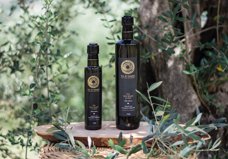
The world of food communication is continually evolving, and the recent launch of the new Oro di Caiazzo’s website – Frantoio Oleario Marco Mondrone is an excellent example. This website, which represents a significant renewal in the company's online presence, is not just a simple showcase but an example of how modern digital marketing strategies can be integrated to enhance brand visibility and engagement. With this new site, Oro di Caiazzo has demonstrated how a well-designed online presence can make a difference in establishing itself in the competitive extra virgin olive oil market. Brand identity is one of the most crucial aspects of design marketing and website development. For Oro di Caiazzo, developing a brand identity that was both authentic and representative was essential. This process involved a thorough reflection on how to reflect not only the quality of the produced oil but also the long history and tradition of the olive mill. The brand identity was built upon a series of visual and textual elements that interweave to tell a coherent and engaging story. The choice of colours, fonts, and images was not random but strategically thought out to create a visual experience that aligns perfectly with the brand’s message. The Oro di Caiazzo website uses a colour palette that evokes the natural tones of oil and olives, with shades that suggest the deep green of ripe olives and the bright gold of extra virgin oil. These colours not only enhance the site aesthetic but also help establish an emotional connection with visitors, evoking feelings of freshness, quality, and authenticity. The fonts used are elegant and readable, chosen to reflect the tradition and refinement of the olive mill while maintaining a modernity that aligns with contemporary web design expectations. The site structure was designed to guide users through a well-defined journey, starting with an overview of the brand and progressing to product pages and contact information. The navigation design was crucial in ensuring that the site was user-friendly and that the user experience was positive. The homepage serves as an introduction, presenting an engaging image and a clear message that communicates the essence of the brand. From there, users can easily access different sections of the site thanks to an intuitive navigation menu. The product pages are designed to provide detailed information about the offered oils, including health benefits, organoleptic characteristics, and usage recommendations. Each product is showcased with high-quality images that allow users...